
Chromalytics
COLOUR INSIGHTS
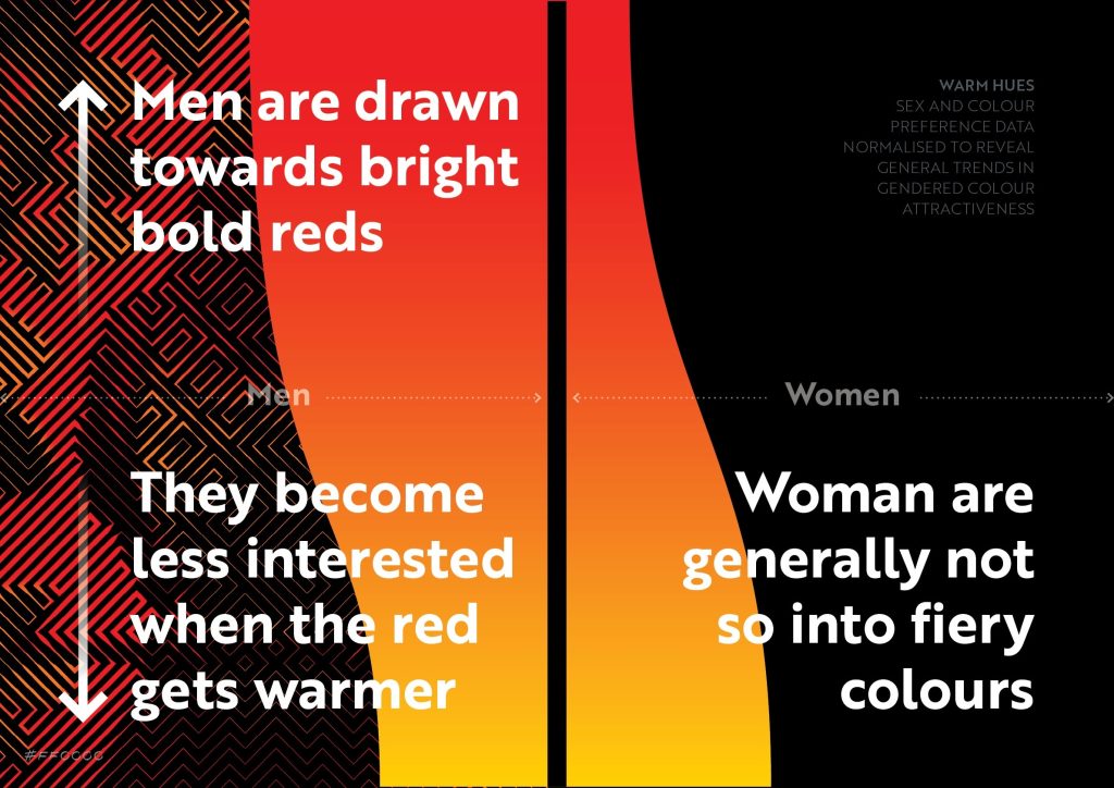
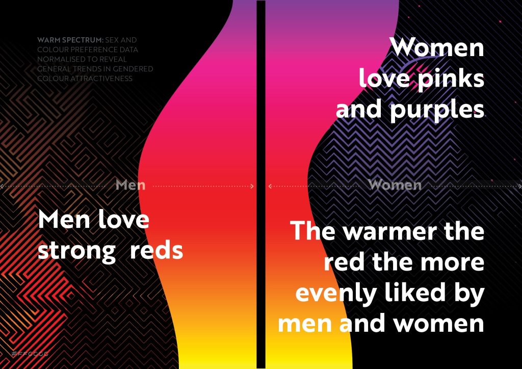
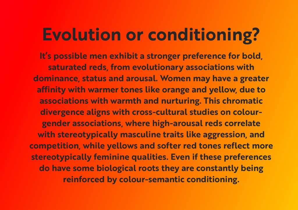
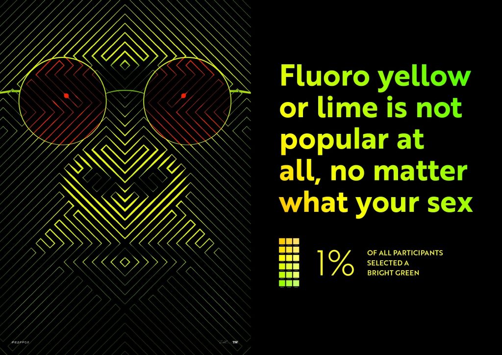
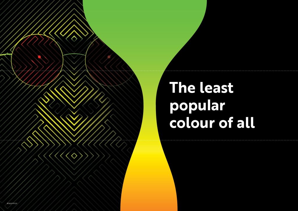
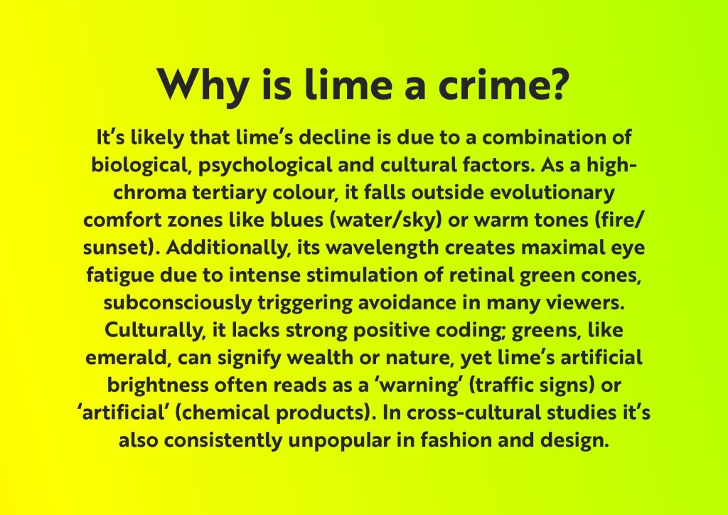
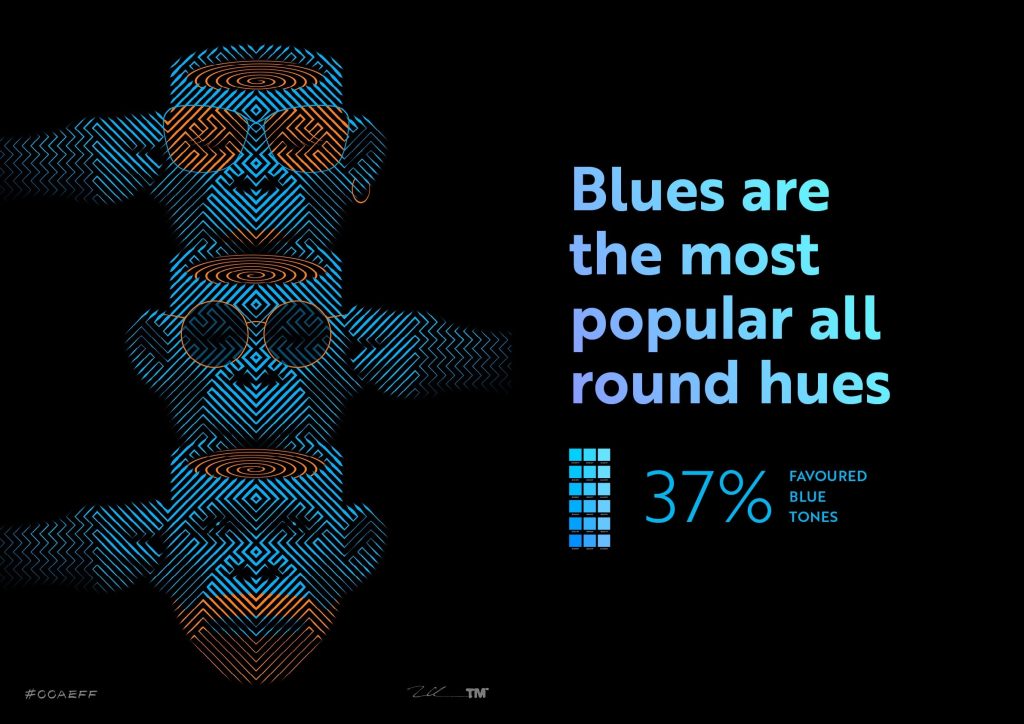
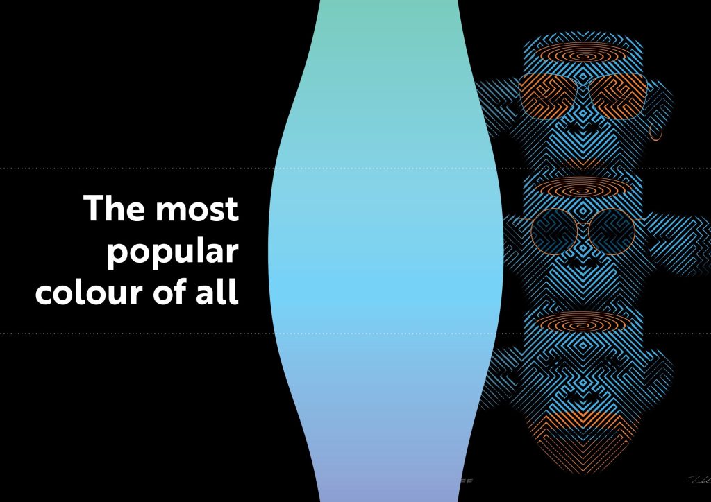
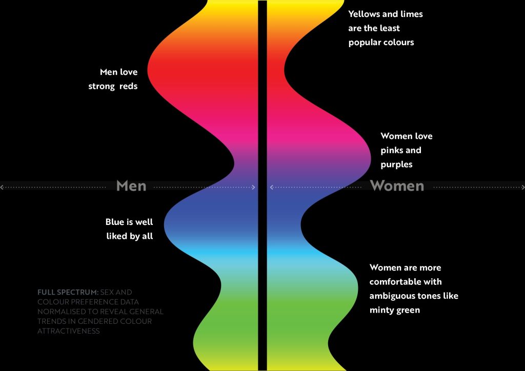
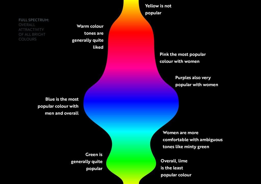
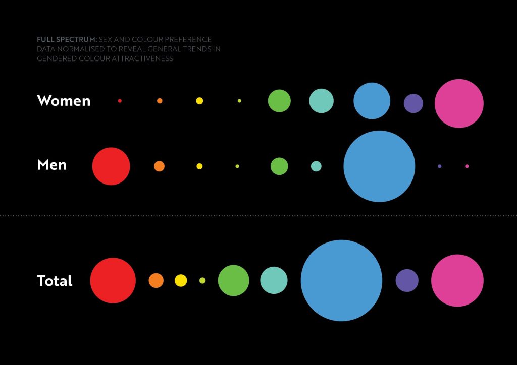
During the NZ Art Show I introduced my #YOUHUE collection and encouraged hundreds of visitors to note down their preferred colour from swatch books containing a curated selection of bright tones.1 Here are some of the key findings from the data he collected.2
1. The #YOUHUE palette features vibrant, saturated colours – deliberately excluding muted tones, shades, neutrals, and bright pastels. This ensures the desired energy and contrast effect synonymous with Tim’s print collection.
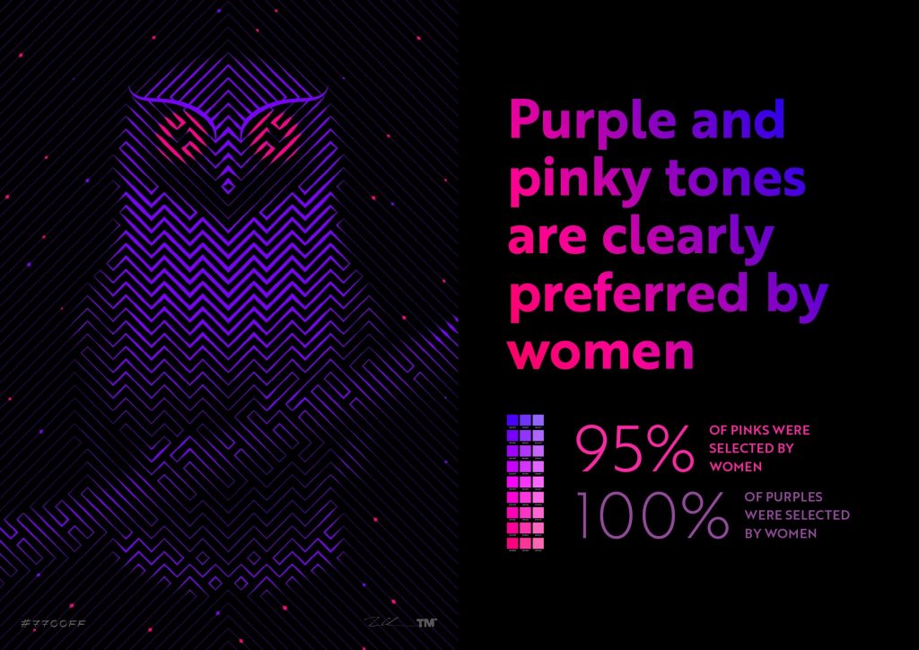
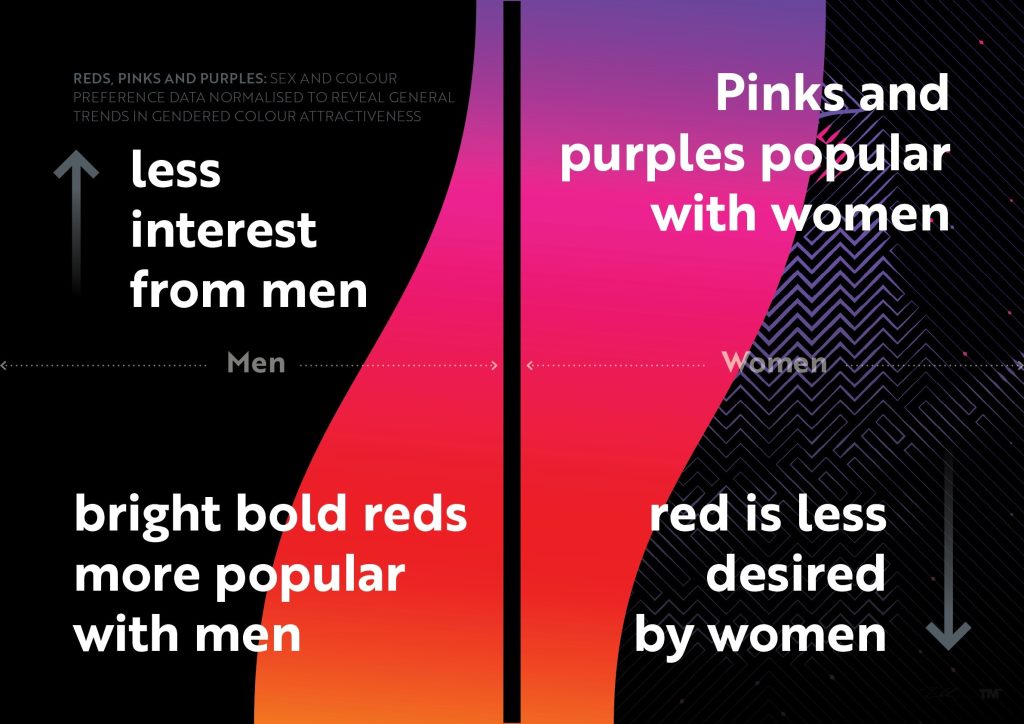
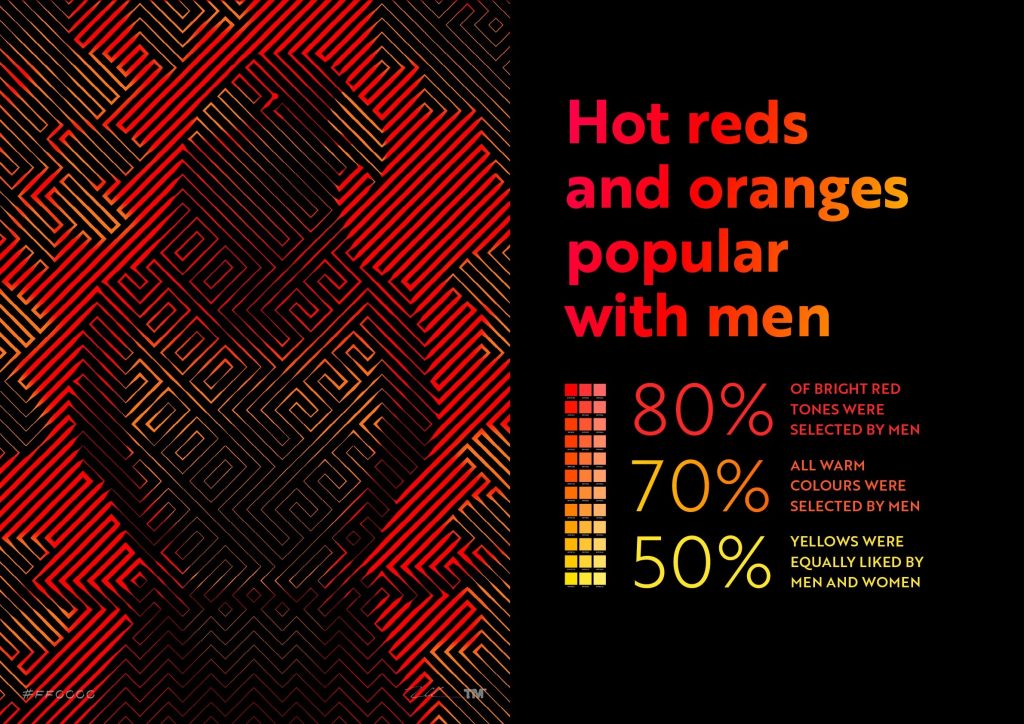
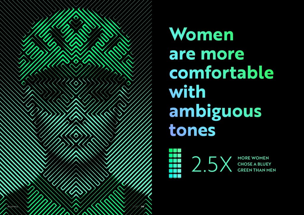
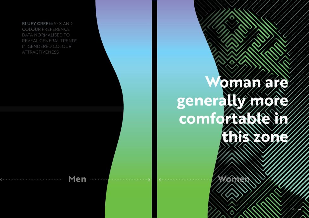
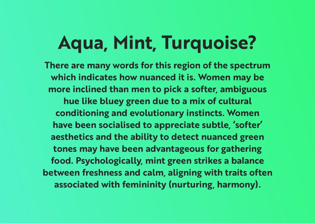
2. Explicit gender data was not collected, so gender classification was inferred from each participant’s first name to enable analysis of broad masculine/feminine colour preference trends.
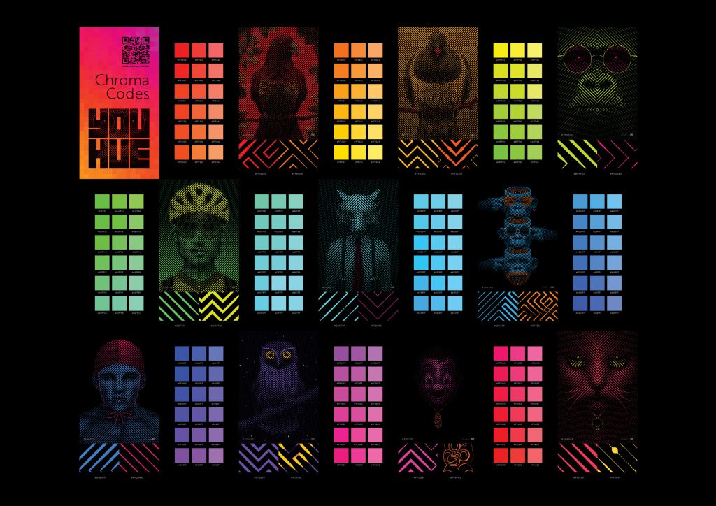


Full #YOUHUE collection
-

Stag
From $1,590.00 -

Leonardo
From $1,590.00 -

Large Tiki
From $1,590.00 -

Professor Congo
From $1,590.00 -

Kereru
From $1,590.00 -

Pucci
From $1,590.00 -

Wolf of Wall Street
From $1,590.00 -

Under Pressure
From $1,590.00 -

Tiki / Polydot
From $1,590.00 -

Tiki Two
From $1,590.00 -

Tiki One
From $1,590.00 -

Skiracer Girl
From $1,590.00 -

Skiracer Boy
From $1,590.00 -

Cannibal
From $1,590.00 -

Ruru
From $1,590.00 -

Ruru / Polydot
From $1,590.00 -

Polarbear
From $1,590.00 -

Piwakawaka
From $1,590.00 -

Pukeko
From $1,590.00 -

Piwakawaka / Polydot
From $1,590.00 -

Babe
From $1,590.00 -

Nonbinary
From $1,590.00 -

Monkey Guzzle
From $1,590.00 -

Merino
From $1,590.00 -

Maori Doll with Toki
From $1,590.00 -

Lifesaver Girl
From $1,590.00 -

Lifesaver Boy
From $1,590.00 -

Labrador
From $1,590.00 -

Kereru / Polydot
From $1,590.00 -

Hei Matau
From $1,590.00 -

Giraffe in Scarf
From $1,590.00 -

Generations
From $1,590.00 -

Four Square Man with Tiki
From $1,590.00 -

Coexistence
From $1,590.00 -

Chocolate Fish
From $1,590.00 -

Mr Zee
From $1,590.00 -

Mr Mistoffelees
From $1,590.00 -

Buzzy Bee
From $1,590.00 -

Beautibull
From $1,590.00 -

Helium
From $1,590.00 -

Boxer Boxer
From $1,590.00 -

Bikeracer Girl
From $1,590.00 -

Bikeracer Boy
From $1,590.00 -

Four Square Man / Polydot
From $1,590.00
“#youhue gave me the flexibility to select the colourway I wanted for our space. As I designer having this choice broadens my options.”
Ange Hiddleston / DESIGNER & COLLECTOR